test
prototype
ideate
case study
-
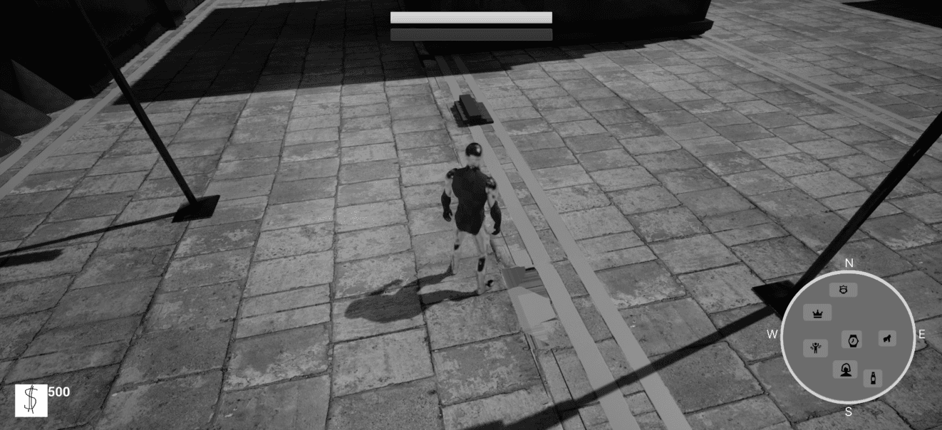
Grisch simulator.
The UX design aimed to balance humor with accessibility, ensuring players could enjoy both the absurd satire and the core mechanics without friction. This case study highlights how user research, iteration, and testing shaped a seamless experience where status, luxury, and satire merge into gameplay. The project began as a parody of urban lifestyle games and evolved into a full-fledged experience combining combat, economy, and social simulation.
TEAM
Game designer
UX/UI Designer
3 Designers
DURATION
3 weeks
MY ROLE
Game designer
Designer
UI designer
TOOLS
Figma
Unreal engine
Photoshop
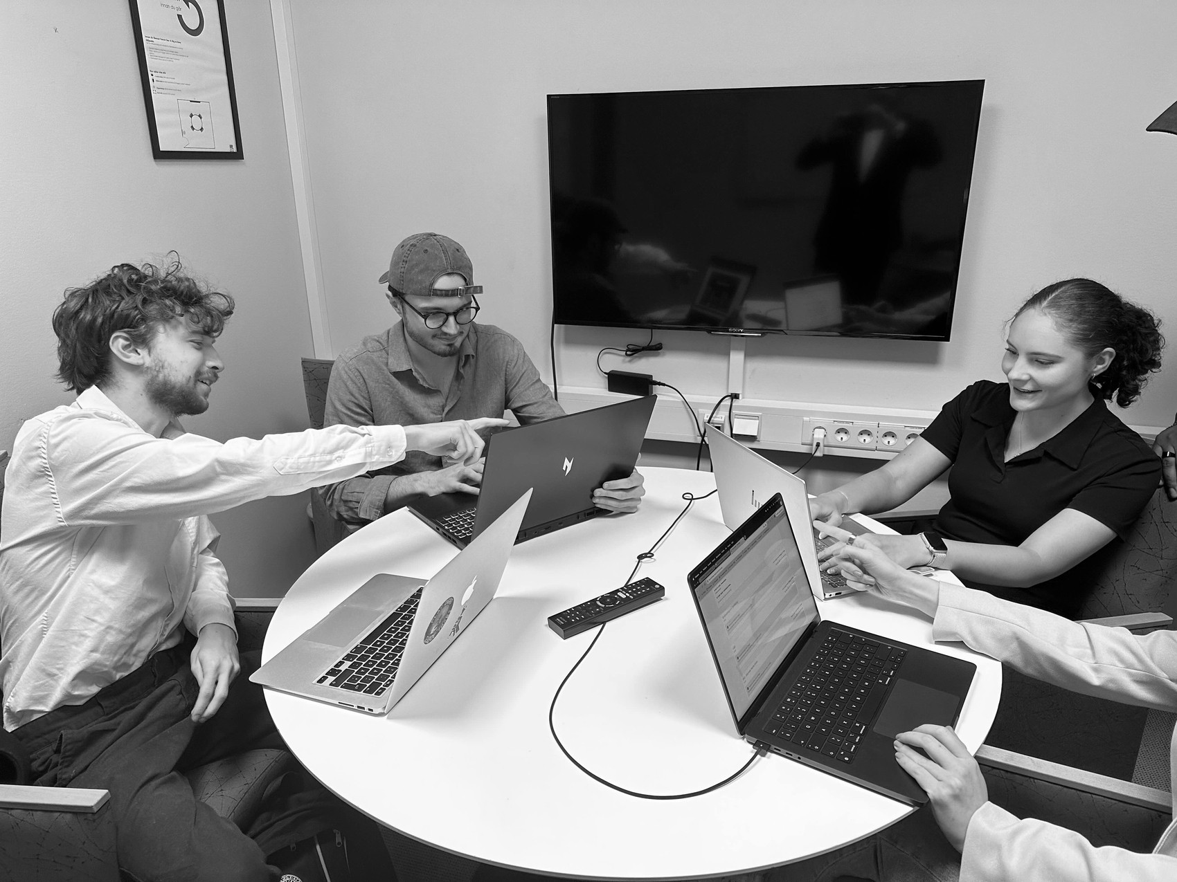
Our team combines different creative strengths to build a smooth and engaging player experience. The team consists of Simon Bengtsson, Game Designer and UI Lead, who drives the overall game design while ensuring the interface is clear, intuitive, and enjoyable to use. Working alongside him are Marie Bergström, Samuel Arnborg, and Robin Karlsson, all contributing as Designers with unique perspectives on visual concepts, user-centered solutions, and maintaining a consistent and cohesive style. Completing the team is Isabelle Skoglund, our UX/UI Designer, who focuses on shaping the player journey and blending usability with clean, accessible interface design. Together, the team strikes a strong balance between gameplay, visuals, and user experience.
overview
purpose & scope
MEET THE TEAM
design process
summary
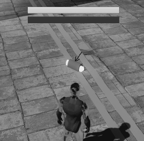
Grisch simulator is a satirical action–lifestyle game set in a caricatured version of Stockholm. Aimed at young adult players who enjoy humor-driven open-world experiences, it blends fighting, economy management, and social climbing with a unique selling point a satirical take on consumerism, status, and materialism.
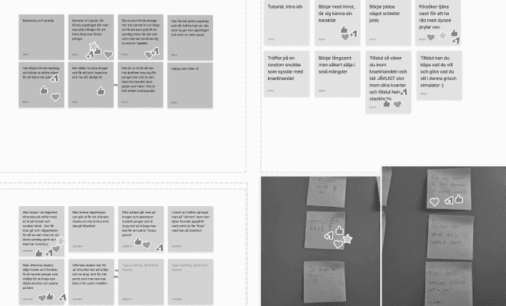
We studied similar satirical games (Postal 4, Rustler) and conducted surveys to understand what players value in parody-driven open-world titles. From this, personas emerged, such as The Status Climber (seeking fast progression and luxury), The Explorer (immersed in humor and hidden events), and The Social Joker (focused on provocation and NPC reactions).
Usability testing involved closed alpha sessions and external beta feedback, where players praised the humor but requested clearer status indicators and more customization options. Accessibility efforts included adaptable controls and a UI designed for readability despite its flashy tone.
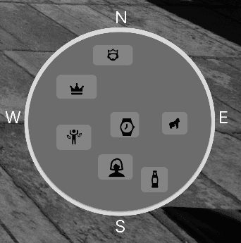
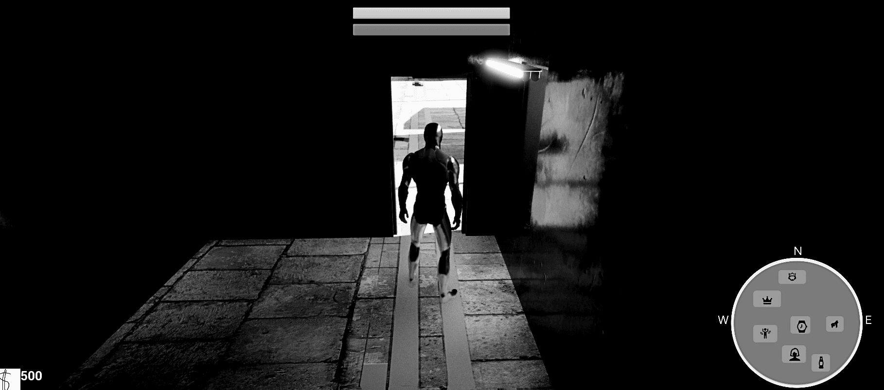
One major challenge was balancing complexity with simplicity — making sure that the satirical tone and exaggerated visuals never overshadowed usability. While the game needed to feel flashy and over-the-top, players also had to quickly understand status, money, and progression without confusion. Through multiple iterations, we refined the menu structure, reduced unnecessary clutter, and adjusted visual hierarchy to highlight the most important information. Feedback from playtests guided these changes, leading to clearer status indicators, smoother navigation, and a more intuitive overall experience.
Player feedback confirmed strong engagement with the satirical theme and UI design. UX metrics showed improvements in task completion rates and satisfaction after iterations. The project demonstrated how humor and luxury aesthetics can coexist with functional usability.
Key takeaways include the value of persona-driven design, iterating UI to balance theme and clarity, and testing accessibility early. Future updates may include expanded social features, more districts, and deeper customization based on ongoing player feedback.
From concept to implementation, Grisch Simulator’s UX journey highlights how satire and gameplay mechanics can reinforce each other. By aligning research, personas, and iteration with clear design goals, the project delivered a humorous yet polished experience that resonates with its target audience.
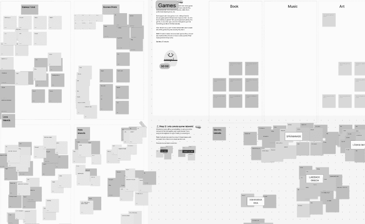
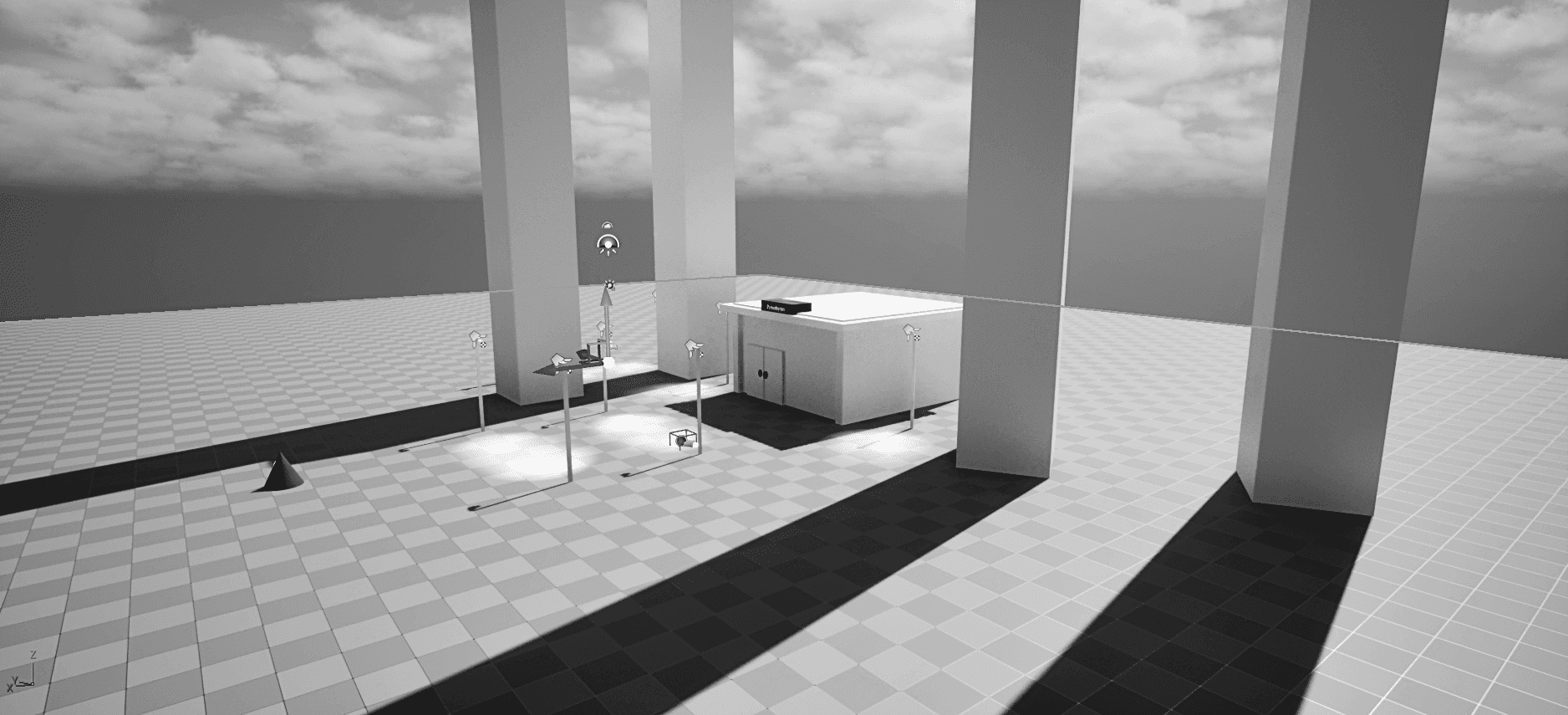
We followed a design thinking approach. First, we empathized with players through research and surveys, shaping personas like the Status Climber. We then defined key goals: clear navigation, rewarding progression, and accessible satire. In ideation, we explored concepts such as a Rolex-inspired health bar and social media–styled UI. These ideas were turned into prototypes in Unity, where HUD and menus were tested. Finally, through testing and iteration, we refined clarity, reduced clutter, and improved customization, creating a UX where humor and usability coexist.
Research & Personas
testing & Accessibility
challenges & solutions
impact & insights
Future outlook
define
empathize